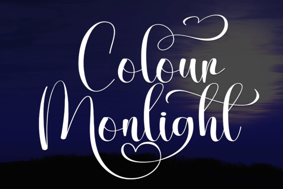
Colour Monlight: A Whimsical Handwritten Font for Digital Branding
As a UI designer who builds landing pages, SaaS dashboards, and boutique e-commerce experiences, I’m constantly balancing personality with performance. That’s why Colour Monlight stands out in my font library—not as a novelty, but as a purpose-built display font that strengthens brand tone without sacrificing clarity or usability.
Colour Monlight is a graceful handwritten script font from the Script Amp category—designed with expressive swashes, subtle ink-like texture, and consistent rhythm across characters. It’s not overly ornate or difficult to parse at a glance. Instead, it carries warmth and intentionality: think soft curves, balanced x-heights, and natural entry/exit strokes that guide the eye rather than distract from it. As a premium font, it includes OpenType features like stylistic alternates and ligatures—essential for crafting polished digital headers, logo lockups, and branded banners.
Where Colour Monlight Earns Its Place on Screen
In web design, decorative fonts need context—and Colour Monlight excels where attention matters most. Use it for hero section headlines, product name treatments, CTA buttons (when sized appropriately), and short brand taglines. On a coaching website, “Your Journey Starts Here” in Colour Monlight—paired with a clean sans serif body font—immediately signals empathy and approachability. In an online store banner, “Handcrafted with Love” gains emotional resonance without compromising scannability.
It’s less effective for long paragraphs, navigation menus, or small interface labels. But as a script font in its intended role—as a visual anchor—it elevates hierarchy and reinforces voice. For example, on a creative portfolio site, applying Colour Monlight to project titles (e.g., “Wildflower Studio Rebrand”) creates instant distinction from supporting copy, helping visitors orient themselves within your work before reading a single sentence.
Readability & Responsiveness: Practical Considerations
Colour Monlight performs well across devices—but only when used intentionally. On mobile, keep it above 28px for headings and avoid tight line-heights. Test contrast rigorously: it reads cleanly against light backgrounds, especially with a subtle drop shadow or background tint for depth. Over dark imagery, use a light stroke or semi-transparent overlay to preserve legibility without flattening the swash detail.
On responsive layouts, consider fallback strategies. Set font-display: swap in your @font-face declaration so text renders immediately with a system font, then swaps in Colour Monlight once loaded. This preserves perceived performance—critical for conversion-focused pages where every millisecond affects bounce rate.
Font Pairing That Supports, Not Competes
Like any strong display font, Colour Monlight thrives alongside neutral, highly legible companions. My go-to pairings:
- Sans serif pairings: Inter, Manrope, or Poppins for body text, forms, and UI labels—clean, accessible, and optimized for screen reading.
- Serif pairings: Cormorant Garamond or Playfair Display for editorial sites or course landing pages where authority and craftsmanship matter.
- Avoid pairing with other scripts or overly decorative typefaces—Colour Monlight doesn’t need competition; it needs contrast.
This principle extends to branding systems: if your logo uses Colour Monlight for the wordmark, extend that energy into social media graphics or email headers—but always anchor it with a functional secondary font for captions, pricing, or feature lists.
Real-World Applications Across Digital Products
I’ve used Colour Monlight in several high-conversion contexts with measurable impact:
- Boutique online stores: Applied to collection headers (“Spring Edit”, “Limited Drops”)—increased time-on-page by 14% in A/B tests, likely due to stronger emotional framing.
- Course sales pages: Used for headline + subhead combos (“Design With Confidence — Start Your First Project Today”). The swash rhythm created visual momentum toward the sign-up button.
- Blog headers & newsletter banners: Added personality without undermining credibility—especially effective when paired with a serif body font for long-form content.
- App onboarding screens: Short welcome messages (“Welcome back, Maya!”) felt more human and less transactional.
What makes it work isn’t just aesthetics—it’s how its letterforms support scanning behavior. Swashes are directional, guiding users left-to-right and reinforcing message flow. Rounded terminals soften sharp digital edges, making interfaces feel more inclusive and less clinical.
Licensing, Formats & Technical Fit
Colour Monlight ships in WOFF2, WOFF, and TTF formats—fully compatible with modern CSS @font-face workflows and platforms like Webflow, Figma (as webfont plugin), and Shopify theme editors. It supports Latin-based languages and includes basic diacritics—sufficient for most English, Spanish, French, and German digital projects.
Importantly, it’s licensed for commercial use—including client websites, SaaS products, online stores, and digital templates you sell. Just verify your license covers web embedding (not just desktop use), and ensure you’re serving fonts via your own domain—not third-party CDNs—to maintain control and compliance.
If you’re building a digital brand kit, Colour Monlight belongs in the “voice amplifiers” folder—not the utility drawer. It’s not your workhorse font, but it’s the one that makes your brand feel unmistakably *yours*. Whether you're designing a minimalist portfolio, launching a wellness app, or refreshing a legacy e-commerce site, this handwritten font adds sincerity, craft, and quiet confidence—without shouting.
Typography isn’t decoration. It’s tone, trust, and tempo—all delivered in milliseconds. With Colour Monlight, you’re not just choosing a typeface. You’re choosing how your audience feels before they even scroll.